Celebrating two intense years
Every year the Seattle Central Creative Academy graduating class puts on a portfolio show celebrating the hard work everyone has invested in for the past two years. It’s usually a fun time with family and friends, beer, networking, and super crowded rooms.
Our class was thrown a curve ball when COVID-19 dramatically limited social gatherings. How could an online experience meet the expectations of an in-person exhibition?
If you didn’t just come from there, check out the site!
My awesome team
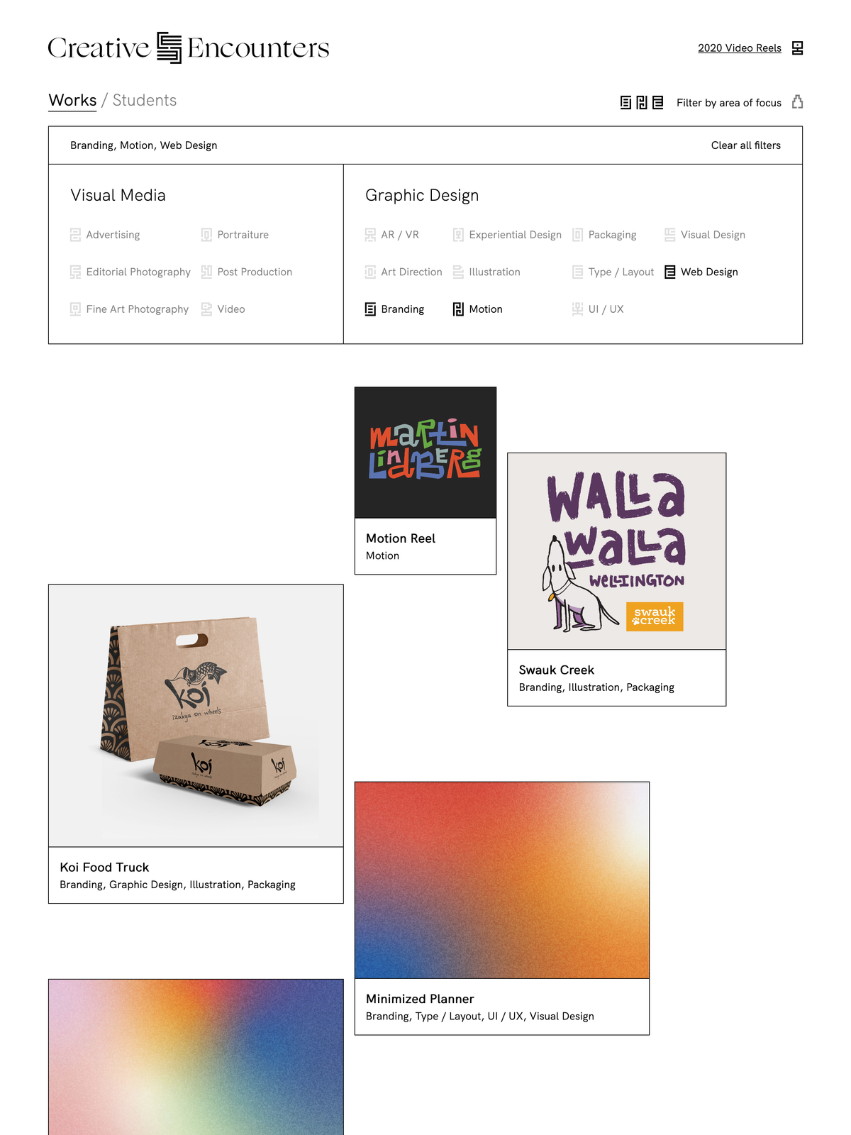
As Lead Web Designer/Developer my team and I were extremely motivated by this challenge. Working together, Christine Chang, Jenny Flick, Dylan Thurgood, Anna Scordato, Tyler Sporer, Vivian Wong, and I developed an experience that functioned as a platform for promotion while facilitating our show’s theme through storytelling, design, and interaction.
Creative Encounters
The branding team, led by Kyra Anderson, did an excellent job crafting a narrative that eloquently addressed our position as students entering this new and uncertain job market—plus (!) they created incredible visuals to match.
The theme, Creative Encounters, used a metaphor of space to represent the nebulous world we as graduates were entering. Students were portrayed as planets sending out creative signals in hopes to connect with design professionals. Likewise, this solution worked as a subtle and relatable way to communicate the context of our online-only event.
Early wireframes and prototypes
In early stages we began to brainstorm ways to engage our visitors such that their experience on our site was at least 10% as exciting as the in-person show. Some early ideas included a retro-futuristic OS a la poolside.fm, or an interactive site that connected visitors similar to paperplanes.world.
We were dreaming big, which was fine in the early stages, but after a virtual whiteboarding session in which we listed and sorted potential user stories, it became clear that those types of interactive websites would detract from the main purpose of our site: helping those in the industry find new creative talent.
Weekly iterations
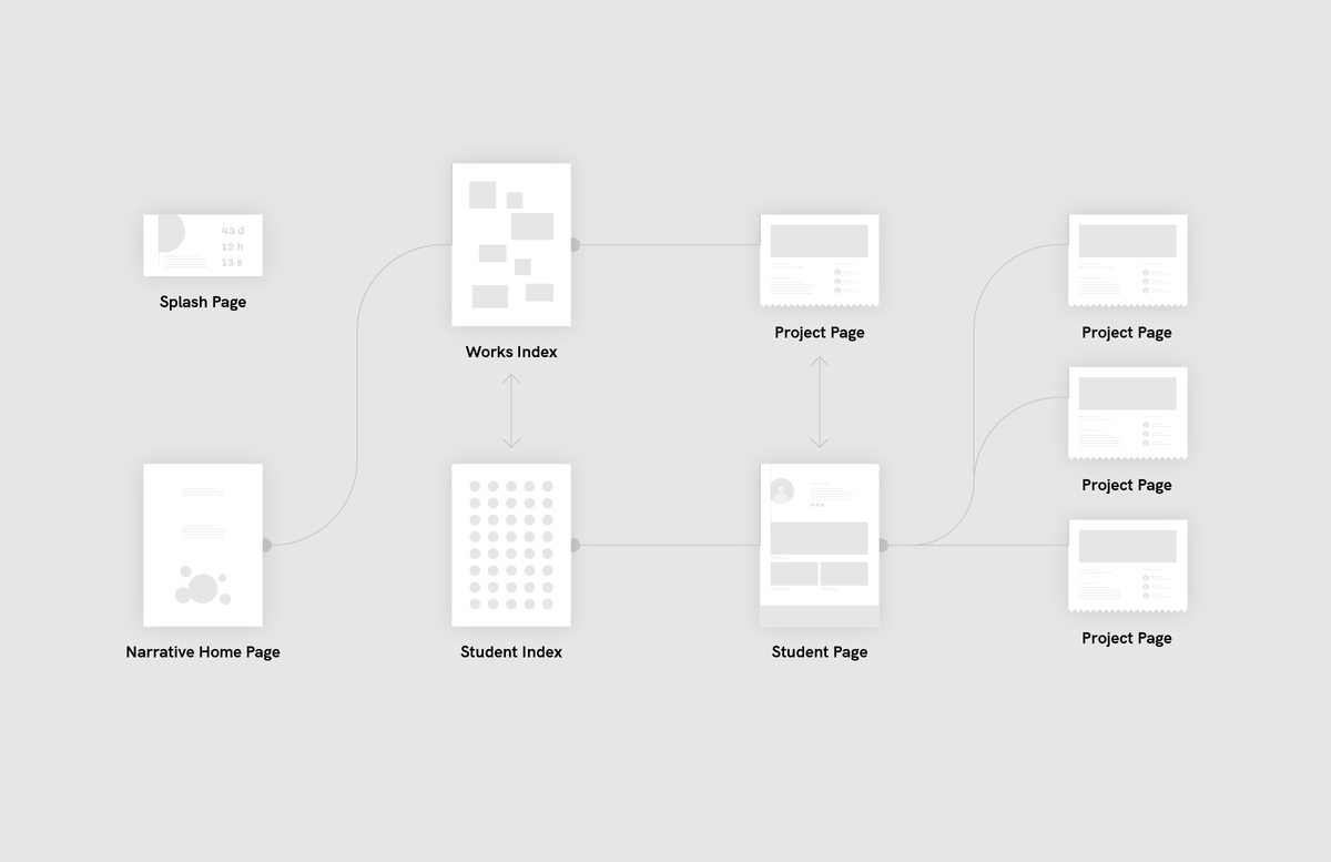
The team and I used Figma to collaborate on wireframe designs that I wired up as prototypes and presented to the class at large the following week.
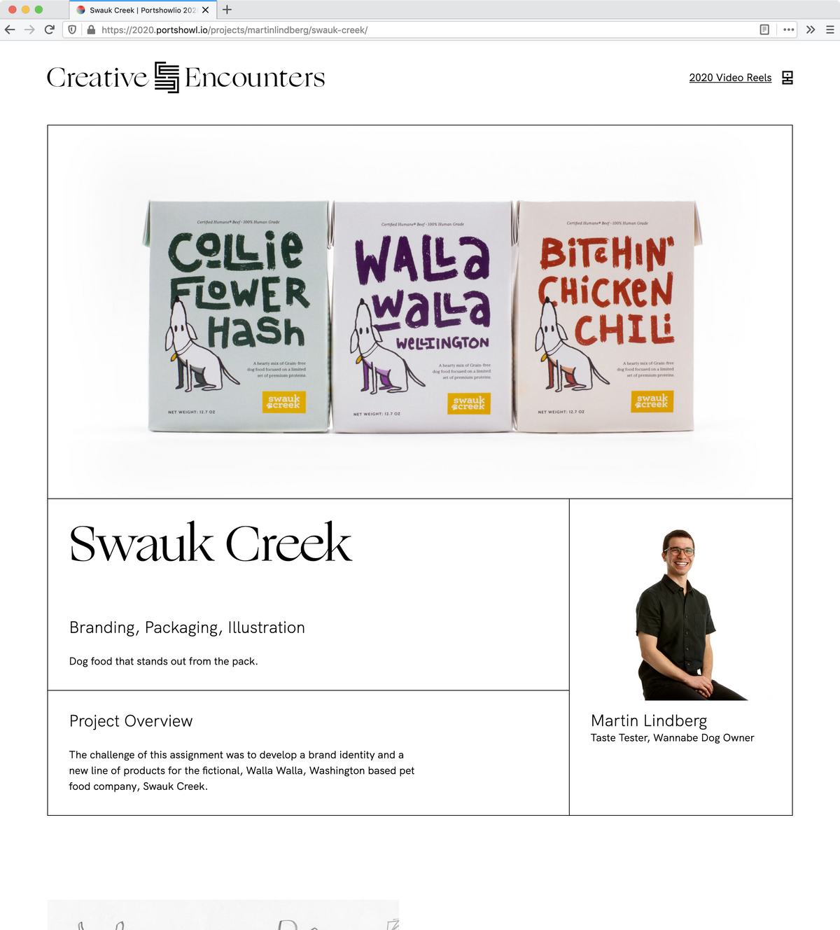
As a departure from previous SCCA Portshowlio websites we decided to create pages dedicated to each project that a student chose to upload. This allowed for a case study style presentation that provided a substitute to an in-person exhibit experience where visitors might have the opportunity to take a deeper dive.
Gamification vs. user needs
We continued to explore potential ways to engage our audience. We debated adding a gamification system that allowed visitors to collect on-brand glyphs and “spend” them as “reactions” to projects and student profiles.
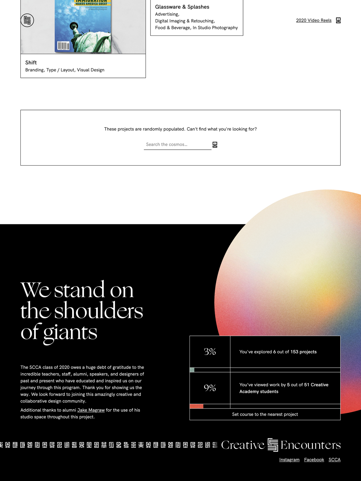
Another idea was born out of a user need that surfaced during interviews of attendees of past portshowlios: how can visitors be sure they’ve seen work from every student?
We brainstormed a couple ways to track the visitor’s progress. Could we create a map of our “creative solar system” that plotted the visitor’s journey? What if there was an ever present progress bar with check points that offered rewards?
It quickly became apparent that these ideas were high effort and low impact features. More importantly, they ran the risk of detracting from our site’s main purpose—if visitors are browsing just to gain rewards or tokens are they too distracted to pay attention to our work?
Instead, we simplified the progress bar feature into a less prominent statistic tracker that existed in the footer. This was a more passive solution that placed the component near other exploratory features such as the “Similar projects…” and “More creatives…” sections that linked to random works.
Drag me!
Designing two sites at once
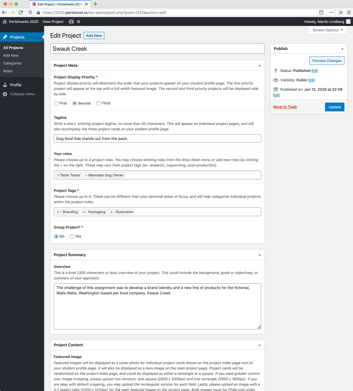
In addition to the public facing Portshowlio 2020 website, we were also responsible for designing the user experience of the WordPress admin panel that students would interact with in order to upload their projects and fill out their profiles.
Anna Scordato, Tyler Sporer and I created the Advance Custom Fields for students to fill out and simplified the WordPress UI for a more streamlined user experience for the students.
A note on development techniques
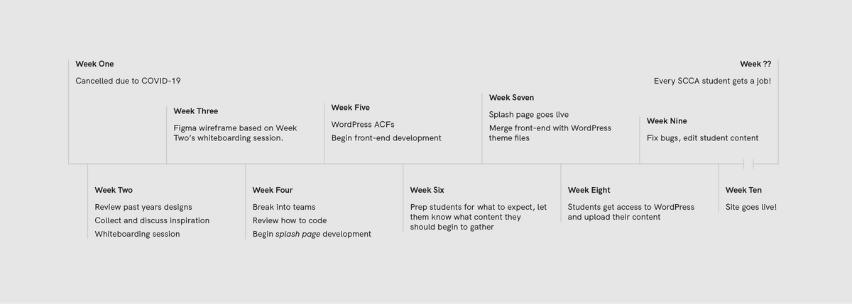
As team lead I was responsible for giving a refresher course on HTML, CSS, JavaScript, and PHP, as well as establishing a week-by-week development roadmap.
I set up a GitHub Team with two repositories: one for collaborating on front-end code and another to develop the WordPress theme. We created PHP and SASS files for each component in our wireframes to stay organized and used SASS loops and scoped styles for cleaner code.
Next time I graduate…
This project was a lot of responsibility. Due to COVID-19, this website became the main interface for the public to see all the hard work we had been up to for the past two years! I was pushed to learn so many things on the fly, from SFTP permission issues, to 302 vs 301 redirects, performant HTML Canvas animations, successful AJAX calls, and more. I can say with confidence that I met each and every one of those challenges.
Since its June 17th launch date the site has had 17,000 page views with a bounce rate of 33%! So, on that note…